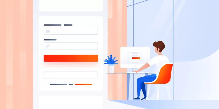
How to design an effective login page and what mistakes to avoid
Designing a website is no simple task. A website is a large project that is made up of a whole host of little decisions that make up and ultimately determine how your website looks. In this process, you will be faced with decisions that you most likely take for granted when you visit other websites.
An example of one of these minor decisions is the layout of your login page.
User experience refers to the experience a person has using a product like a website and if they have overall had a pleasant experience or not. Your website is the most important tool for your business and during the design process, you should view the entire project through the lens of the customer experience.
Functionality is so important on a website. Technical difficulties, slow loading times, having a hard time locating what they are looking for, and other issues like this can ruin the user experience. In the case of login pages, this user is a vested user who are either already members or users that are looking to sign up.
For your entire site, you will want to carefully plan and place each component. The purpose of today’s article is to look at best practices for planning and laying out your website and specifically to talk about login pages. We will work our way through general best practices and then discuss login pages design and measuring the success of our login pages.
Let us dive in.
We will start with web design best practices to keep in mind for your whole site.
1. Keep Your Page Load Times Down
Okay, we won’t get too technical here, but this point needs to be made. Users do not want to sit around waiting for your page(s) to load. Again, we won’t dive into the backend side of things here but do a quick search and find ways to keep your load times down.
2. Consistent Style Across All Pages
From anchor pages to your landing pages you will want to have a clearly defined theme and style to your site. Building off of your logo, keeping a similar color profile laid out across your pages will have your visitors feeling familiar and like they are in the right place.
3. Keep Navigation Simple
Don’t overcomplicate your website with messy nav bars. Your main navigation bar should have only the essential and you can add drop downs on them for your subpages. The last thing you want is to overwhelm your website visitors. Make it easy for them to get where they’re going.
4. Have a Call To Action (CTA) on Every Page
Calls to action are the way you turn your website traffic into customers for your business. The goal here is to make everything simple for the users. No matter where they land, or where they go on your website, we want to make it an option for users to leave their information and potentially turn into a customer.
5. Keep Content Easy to Read
There are numerous ways to do this, but you do not want users landing on your pages to see big long chunks of text. There are several strategies for this but let’s discuss a few of them.
First, you want to keep your paragraphs short and to the point. Break your text up into smaller more digestible pieces.
Next, switch up the format style. Notice how this article is broken up into numbered sections right now? This is also an effective strategy.
Similarly, breaking up content by bullet points is a good idea.
Bullet points make your on-page content look less overwhelming.
Bullet points help you make your points more quickly.
Don’t bore users with information overload!
The last bit of advice on making you on page content fits here, but it’s probably best as its own topic.
6. Use Multi-Media
Use a variety of images, graphics, videos, charts, banners, and anything else you can think of to spruce up your on-page content. Multi-media will add personality to your page, it will engage your users, and most importantly it will serve as entertainment.
7. Use Plugins
Whatever you host on, you want to utilize plugins to add functionality to your site. Let’s use an example and say you use WordPress to host.
So, you set out and search top WordPress plugins. You run a hair salon and want people to be able to book appointments directly on your site which means specifically you are looking for a WordPress booking or appointment plugin.
Well, you are in luck.
You stumble across Bookly, which is an appointment management system plugin. Adding these types of plugins to your site will be an enormous value add for your users.
Okay, so to this point we have gone over general best practices for your website. We will now turn our attention to login pages specifically, and tips and strategies for optimal design.
When you are designing it is vital to keep your user at the front of mind. I’m sure that point has been driven home to you by now, but it cannot be stressed enough. Creating buyer personas is an incredibly helpful exercise in the design process.
It’s important to make sure we are all on the same page here. For those of you asking what a buyer persona is, let us start there.
A buyer persona is defined as a representation of your ideal customer that you have created based off of research and data about your customers.
In every design decision, you should start by considering your buyer personas. In this case, meaning login pages, you have two real personas here to consider.
Let us separate them out and look at them individually as we start to map out our design.
1. The Perspective Member
This buyer persona is the new user on your site who is interested in becoming a member but does not currently have an account. The goal here, and it will solve both buyer personas, is to make it clear and easy where the login is and where the member registration is.
Make these options distinctly different. A good strategy is having two different boxes for these functions and use different colors to distinguish them. Additionally, use clear big text to identify the different boxes.
Don’t make this too complicated.
On that same note, let’s talk about informational fields. The best strategy here is to stagger the information you need. First, identify the absolutely necessary information you need for a new member.
Ideally, keep it simple and just ask for their first and last name and email on the main page. You can then send them to a secondary page where you can ask for more information to finish up the signup process.
2. The Returning Member
For this buyer persona, we are looking at a person who is a returning member that really just wants to log in easily and as pain-free as possible. Of course, the formatting notes from above still apply here, but the way to really enhance your login experience we want to add options here.
These options will be aimed at making this process super easy and streamlined for your returning members. Let’s look at several ways to make this process simpler.
First, let’s make it easier for our users the next time they return to login. Provide a checkbox that says, “Remember Me”. This will now allow your site to prepopulate this user’s login information the next time they return on this device. For these users, they will now only have to hit the login button when they return to your site.
Simple.
Okay now let’s make it easy for those that are typing in their passwords. Remind people that passwords are capital sensitive. This seems low bar but trust us that this will help people in their login process.
Now for those forgetful users who did not click the remember me button, are on a new device, and or did not write down their password and or username.
These people are screaming, “Help!”
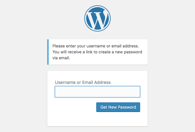
Two easy buttons will solve all of these worries and concerns. You will want to provide a “Forgot Password” button as well as a “Forgot Username” button. From here you will want to send users a set of instructions to either recover and or reset your password and username and now access your account.
Pro Tip: Show your users that you care and alert them to click the “Remember Me” option and or write down their password so they do not have this issue in the future. Proactive helping like this will help build trust and relationships with your users.
Okay, to this point we have covered a lot. Next, we will be looking at what we can now do to track and measure the level of success that our design and page setups are working. You will want to give your site at least 90 days to build up data and then you will want to set up A/B testing to continue to develop and improve your site.
Before we get too far down this road, let’s recap quickly everything we have covered so far.
Website Design Best Practices
- Make sure that your pages load quickly. Users are not exactly patient.
- Build a consistent style and theme across your website.
- Make navigation easy for your users.
- Utilize CTA’s on every one of your pages.
- Keep your content broken up and digestible. No long paragraphs!
- Spruce up your pages and keep them live with the use of multi-media.
- Utilize plugins to add advanced functionality to your pages.
Login Pages Best Practices
- Create buyer personas and understand who your end users are.
- Make new member sign-ups and returning member sign in options easily identifiable.
- Make sure both processes are painless and simple. Streamline the work users need to do.
- Give recommendations and helpful tips in both process’ to show your user you are here to help and that their experience matters.
- The overall big important takeaway here so far is that you need to always put yourself in the user’s shows. Make every decision for your website through the lens of the user experience. User experience is king!
Now let’s get into tracking.
The first thing is first, and no this is not a Google plug. The truth of the matter is that there simply isn’t a better website analytic tool than Google Analytics.
Set up a Google Analytics account and take a quick online training class to understand how to utilize this tool to your full advantage. Google itself provides these courses and they are free. So, with that said, we will not be doing a full tutorial of Google Analytics today, but we will give you some general tips to now measure all of the design work we have covered.
1. Set Up Your Business Goals and Goal Completions
What are the goals of your website? A ton of traffic that is not producing any measurable business for you isn’t really worth your time. Identify the goals (meaning actions on your website you want to see traffic doing) and create them as goal completions in your analytics account.
2. Monitor Your Users Search Terms
Full disclosure, to do this, you will need to create and link a Google Search Console account. This is free, easy, and Google help can tell you how to do this quickly and easily. Once you do this, make sure to see what search queries are being used to reach your website. Use this data to continue to tweak and tailor your search engine optimization strategy.
3. Use the Page Analytics Tool
Use this tool to identify what spots on each page are drawing the most clicks and attraction. You can utilize this tool to see what is effectively working or not working on your pages. In the case of Login Pages, this can be valuable data.
4. A/B Testing
For underperforming pages try switching things up and running tests to try new strategies side by side. Record the data and make the necessary changes as you go. Websites are a living organism that are in need of constant attention.
We hope that this was all helpful today. Design is a large scoping topic and is a process that is never finished. These best practices will serve you well as you design, create, implement, and monitor your website. Good Luck!


