20 tips for creating a great website header and footer design
As the saying goes, “you only have one chance to make a first impression – so you better get it right”. What is less well known is how quickly website visitors form that impression. Studies have shown that visitors only take 50 milliseconds to form an opinion about a website design. What’s more, the majority of people will navigate away from a website within the first 10 seconds.
The header and the footer are critical for creating a favourable impression and increasing user retention. The website header will be one of the first elements a visitor sees. If a visitor has scrolled down to the footer then typically they have failed to find what they need from the rest of your website. Your website footer may be your last chance to keep that user on your site. In addition, the header and footer will almost always be visible on every page of the website.
These are not elements you can afford to get wrong. To help, here are 20 tips for ensuring that you have the perfect header and footer.
1. Establish what you need to include
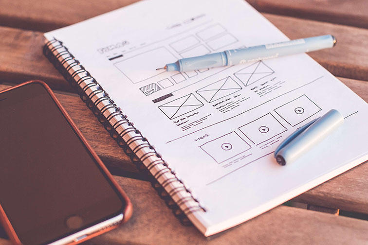
For both the footer and header collect all of the potential links and elements that you may want to include. Then pare these down to the most essential. Usually the header will always include the following:
- Main menu (navigation)
- Page title
- Logo
Depending on the type of website the header may also include:
- Search
- Shopping cart
- Social icons
- Login / registration
Space in the website header is usually at a premium. If you feel an item is important, but isn’t a “make or break” element, then you may want to consider adding to the footer instead.
2. Fixed vs. floating
Headers can be either fixed or floating. If fixed, then as the user scrolls down the header will stay in place at the top of the page. It will not follow the viewport as the user scrolls. In order to view the header the user will need to scroll back up to the top of the page.
With floating the header stays in the users viewport as they are moving down the page. A floating header will take up more room in the viewport but it makes it easier for users to navigate to other pages. If you have long pages then a floating header will likely be a good option.
3. Start with the most important action first
Think about the single most important action that you want visitors to your website to take. For most websites there is one action that all of the elements of the website are designed to move visitors towards.
For a restaurant this might be a button to make an online booking. For a marketing agency it might be a contact form. For a charity it might be a donate option. Whatever that action is, you want to include it prominently in the header.
4. Use shrinking for large headers
If you have a large, floating header then you will probably want to use shrinking. This will reduce the size of the header as the user scrolls down the page. The benefit of this is that the user still has easy access to the header but it takes up less area on the screen. If you use a shrinking website header design, then only include main menu and logo.
5. Use a transparent header were appropriate
Bold images above the fold have become a popular website design element. To ensure maximum impact you can make the website header transparent. This allows the image to take over the whole screen when users land on your website. At the same time users can still easily view the navigational elements.
6. About us and contact information
After visiting the homepage 52% of visitors want to learn more about the company. Customers want to know who they will be doing business with. One of the first pages people will want to view on a website is the “about us” or “team” pages.
To make sure that these two pages are easy to find include them in both the footer and the header of the website. The team page is also important because people may have direct connection with a specific employee within your organization.
7. Contact us
Your “contact us” page will likely be one of the key stages in your sales conversion funnel. This is particularly true for service based businesses, where people will want to obtain further information before they are willing to make a purchasing decision. Your “contact us” should be featured prominently in both the header and the footer in order to increase the number of people who click through.
For brick and mortar businesses the contact us page will feature directions and a map to your store locations. Again, you need to make sure that these are as easy to find as possible.
Because of the importance of the “contact us” or “book an appointment” tab you may want to further highlight by creating a button which stands out from the colours around the header.
8. Contact information in the footer
44% of people will leave a website if there is no contact information. In addition to your contact us page, include your key contact information with the footer of the website. People who are looking for your contact information or physical address shouldn’t have to search through your website to find it.
This should include your address, phone number and email address. These should be clickable, so that when a user selects the email address, it opens their mail client (ideally with the subject autofilled). For mobile devices the phone number should be “click-to-call”.
9. Group pages under specific headings
If you want to include links to multiple different pages within your footer, group them together and then place a descriptive header. These page links can then be organized into columns according by group. For example, you might have one column under the heading “Services”. All of the links in that column would be to your service pages.
10. Copyright, privacy policy and terms and conditions
You want to make sure your business is protected by clearly linking to your privacy policy and T&C’s within your footer. You may also need to link to additional pages like your GDPR policy page. You will also want to include a copyright notice inside of your footer.
In general, you want your copywriting notice, privacy policy and T&C pages to be readily available, but not drawing attention away from more important navigational elements. This can be achieved by using a smaller font and one with less contrast to the footer.
11. Maintain website design consistency
48% of people say that design is the number one factor for assessing the credibility of a business. Unfortunately, the footer, which can often feel like an afterthought, hinders rather than helps that impression. The design of the footer will frequently not reflect the look and branding of the rest of the website. Remember that the footer will be viewable on every page of the website. Subconsciously an out of place footer can leave a bad impression in the minds of the visitors. In order to avoid this keep design consistency between your homepage and the footer. Use fonts and colors which in keeping with the rest of the website.
12. Include a call-to-action
Consider what Call-to-Action (CTA) is a key stage in your sales conversion process. What action could you ask your visitors to take which would have a direct impact on your revenue?
One of the most common actions that can help drive sales is encouraging people to sign-up for your email newsletter. In order to encourage people to submit their email address you can include a newsletter submission field within the newsletter.
You should also include copy that clearly states what you want the prospect to do i.e. “submit your email address” and the biggest benefit of them doing so.
13. Use a sub-footer (if necessary)
The space in your footer is limited and you want to think carefully about what you include. In some cases there may be more information that you want to convey, than the footer allows for. In this case, one solution is to use a sub-footer. In the sub-footer you can include another layer of navigational or branding.
This is a better solution than letting your main footer form becoming too cluttered. You can use the sub-footer for conveying additional information such as the logos of companies that you have previously done business with.
14. Leverage graphic elements
Including too much text in your footer or header can lead them to becoming cluttered. At the same time there may be key information that you want to include. To achieve both of these outcomes you can replace text with graphical elements. As the saying goes “a picture tells a thousand words”.
By using a recognizable, graphical image you can quickly convey information that would take up more space if listed out in words. A common example of this is to use social icons rather than the name of the social platform. At the same time you want to avoid using graphical elements that don’t have a clear purpose in help users to navigate your website. These can be distracting and will make it harder for visitors to find the information that they need.
15. Use easy to read fonts with clear contrast
The footer of your website doesn’t take up much space on the screen. As a consequence it is important that you make it very easy to read. To achieve this you want to use clear contrast between the font and the background colors. Examples of this include white text on a black background. You should also use a font which is easily legible such as sans serif, arial or verdana. The footer is not the place for more elaborate fonts or for varying color schemes.
17. Go small but not too small
The font size and weight in your footer can be smaller and thinner than for the body of the website. For links that are less critical for your sales funnel such as the privacy and T&C page you may want to go to an even smaller size.
That said, you still need to make sure that all of the text in the footer is legible. People who have scrolled down to the footer have failed to find what they need to navigate the website. You want to make sure that if you are providing links to important pages in the footer that visitors are able to see them.
18. Allow sufficient space
One of the biggest mistakes made with footers is allowing them to become too crammed with information. Allow insufficient space can hurt the design of any page of your website, but it is particularly problematic for the footer.
The footer is typically composed of links. If you don’t allow enough room for these links it will be difficult for users to select the link that they need. This can be a frustrating experience – particularly on mobile devices.
19. Avoid footer bloat
Often a website will start out clean and well designed footer with plenty of space. But over time the footer will experience bloat. New pages will be created. Social media accounts will now be considered to be essential to be included in the footer. A newsletter sign-up form will be added as an after-thought.
The end result is that the footer becomes increasingly cramped. Every website will naturally evolve over time but there still needs to be thought put into anything additional that is added to the footer. If the footer no longer accommodates the needs of your growing website consider the option of a secondary sub-footer mentioned above.
20. Add a list of popular or recent articles
Adding a list of your most recent or most popular articles won’t be suitable for all businesses. But, if content marketing is an important part of your selling process, then don’t miss the opportunity to include these in your footer. After all, one good idea is to include the content which is most likely to lead to a sales action. For example, you might have a guide which helps with conversion. This is another good opportunity to expose visitors to this content.
The best way to guarantee an effective, attractive header and footer is to plan for it. These are two of the most important elements on your website. Invest the time to think carefully about what should be included and what can be left out. Focus on those elements which increase the usability of your website and increase sales.


